Chesstris 2000 Postmortem
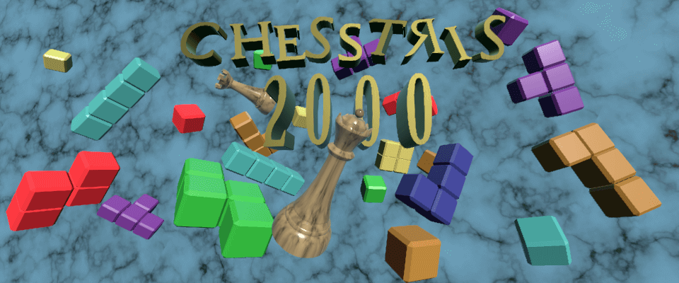
Howdy! As you've found from getting to this page, I recently released Chesstris 2000, my longest, "most gamey" game yet. Also, my first dive into puzzle game design! It started as an idea in August of 2020, was prototyped in six weeks, and was later picked up again for "polish" in late May of 2021, which turned into two months of more development. In going through several art and design iterations, I have learned a lot, and hope to tell you all about it here!
Project Timeline
Background/Inspiration
In January and February of 2020, I set out on Twitch to play a few different variations of Tetris and its spinoffs to see what I could learn from them. What happens when a game idea is perfected and you need to make more of it? After looking at Tetrisphere, Welltris, Tetris Worlds, Tetris Party, and Tetris CD-i, it became clear that a development practice could be "what if tetris but X?" The more memorable ones to me were Tetrisphere and Tetris CD-i, not for their mechanics, but for their style and adherence to something new using the Tetris name.
Fast forward a few months!
Prototype
I don't know when "chesstris" ended up on my list of spur-of-the-moment game ideas, but in a moment of boredom and motivation to start a new project, I took to photoshop on August 6th, 2020 to see how this idea could work. Here's what I came up with:
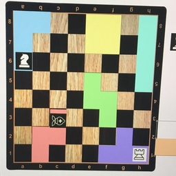
You had your typical chessboard, with some tetrominos, and some chess pieces on the tetrominos. Somehow the game was to manipulate the tetrominos in a certain way such that the chess piece also moved legally. This original Idea involved having multiple chess pieces on a tetromino, like this:
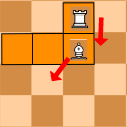 ->
-> 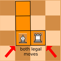
While I found this idea extremely neat with some potential, I had no idea how to develop it. Additionally, it only worked with a limited number of tetromino/chess piece combinations. Intuiting which "focal point of rotation" for each piece was also hard.
Here's another idea I looked at:
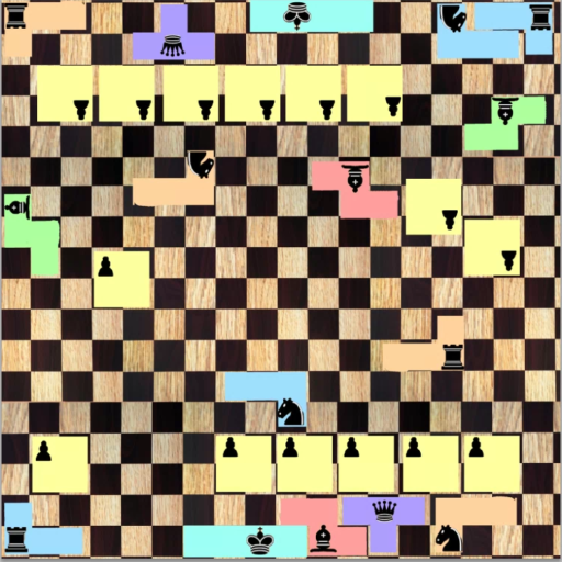
You can probably tell right off that bat why I didn't go through with that one. At this point, I knew how the rules of chess worked, but had little to no experience playing chess. Adding the extra dimension and trying to play chess on top of these other cubes was way too much. Plus, I couldn't find a cool way to organize the pieces in the initial setup so that they fit correctly. Plus, one idea that had caught me early on was that filling a row with cubes would eliminate those cubes, just like in tetris.
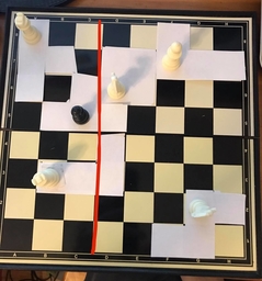
Eventually, I moved to paper prototypes!
 ->
->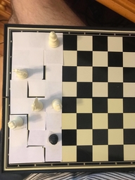
Here is where i settled on mechanics pretty similar to those I had initially played around with in Photoshop. Here, the goal was to move all of the tetrominos to fill the board to the left of the red line. To move the tetrominos, you had to move the chess pieces they were attached to. One rule for rotation here, though: The Chess piece acts as the focal point of rotation for the tetromino. Emergent from this are some really cool things!!
- Chess pieces can have more moves opened up once their respective tetromino is rotated
- Think of the black pawn T piece as a 'door' that opens up for other pieces after rotated
- Pawns being able to move in only one direction can add logical 'flow' to a puzzle
- "OK.. this piece can only move down, so I'm going to have to make this shape with the T piece somewhere over here.."
- Different move patterns of chess pieces add variety in tetromino placement
- With this comes the hardest issue I had to face: Diagonal Movement and Corner Collision (more on that later)
After speedrunning a Unity Chess tutorial on youtube, downloading some free chess assets, and adding my own tetris spin on it.. we eventually get our first playable levels!
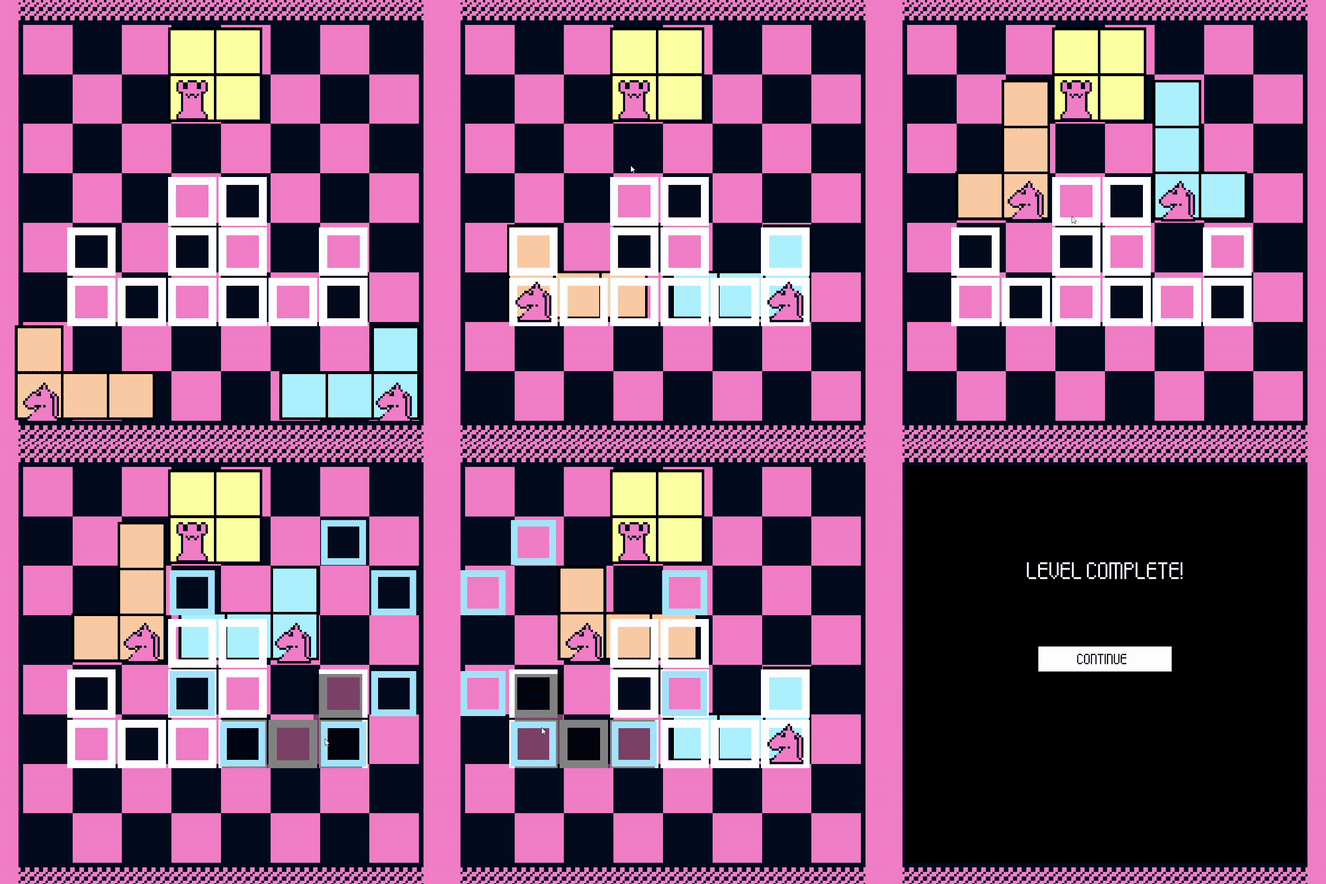
Turns out a lot of what is seen here stayed on to the final iterations of the game, but what I immediately wanted to change was the art direction. What amused me about exploring different Tetris variants were the attempts to bring a fundamentally 2D game into the third dimension. Both Tetrisphere and Welltris tried to do this thematically was well as graphically, whereas Tetris Worlds saw this as an opportunity to give tetrominos faces and cutscenes. Something about the clunkiness of representing Tetris in 3D stuck with me, especially since I was combining it with chess, which is most commonly played (in videogame form) in two dimensions. I had moved from "Old DOS game" to "prerendered promotional art for old DOS game" with a space background and super reflective glass pieces.
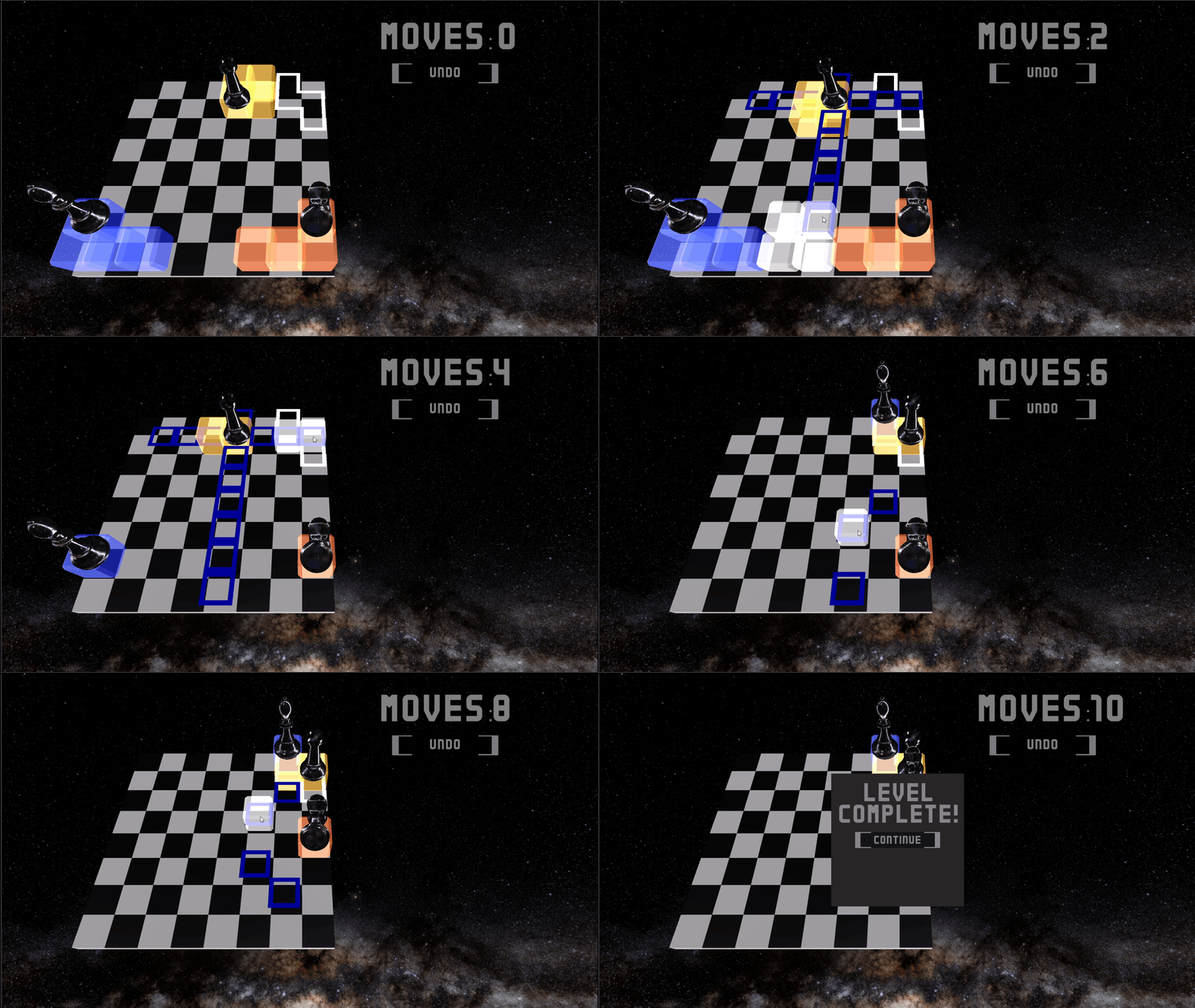
Some experiments in 3D vs. sprite rendering for the pieces:
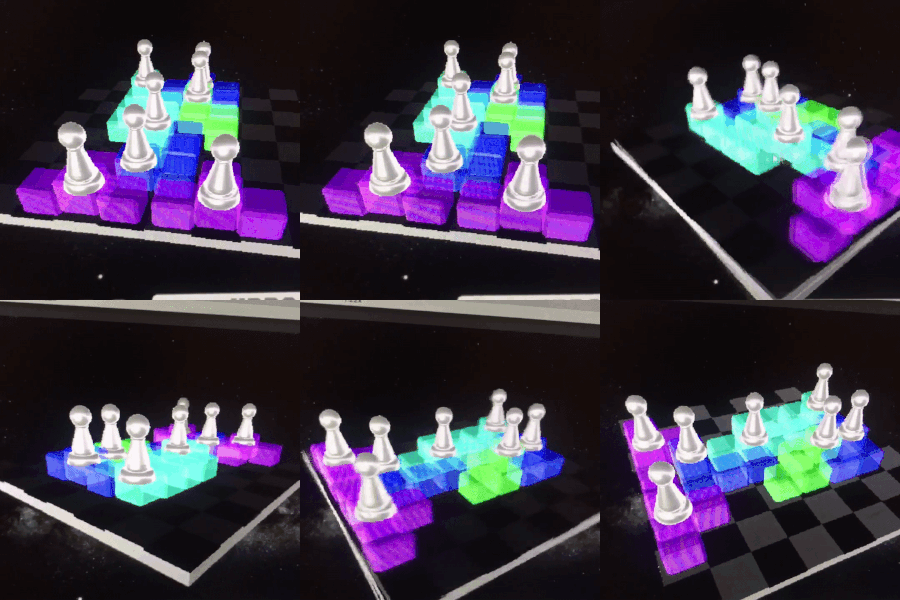
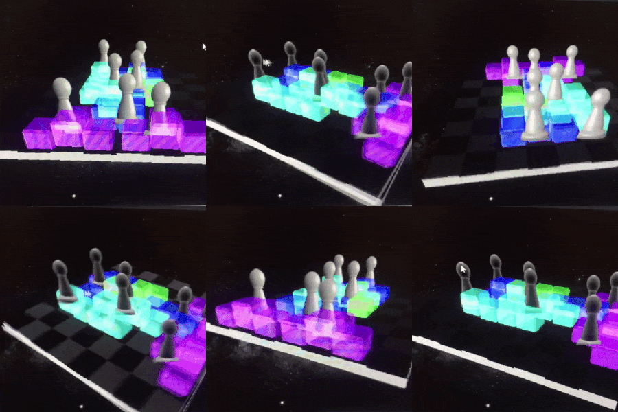
Fast forward a few days, and we have a new feature! In addition to moving and rotating pieces, now you can move the chess pieces on top of the tetromino pieces. (ignoring the rook moving diagonally here!) This allows for some cool maneuvering of pieces around the board.
At this point, I have playtested 10 or so levels (shoutout to Wonderville and their playtest night!) and it was immediately clear that I needed to introduce topics slower.
Now for some more art development! Here is me finalizing the first game level:
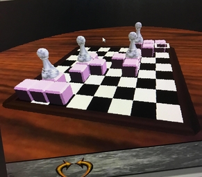 ->
-> 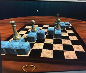 ->
->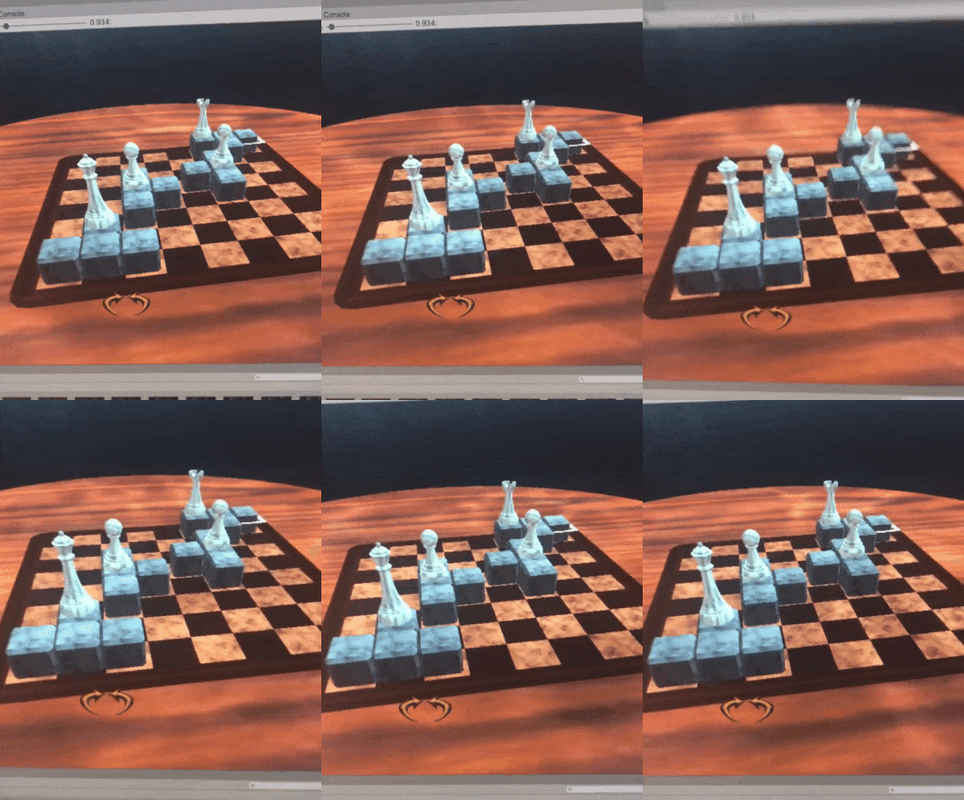
(some excitement after learning how unity light cookies work!)
Final Product
It's memorial day weekend 2021, and I am bored. It's been a month or so since finishing my last project, and I miss the thrill of developing (and , cough, releasing) a game. I pick up Chesstris for more development, and I tell myself OK, I'll spend all weekend polishing it, and then I'm done. No more time after that. I was wrong...
First technical mistake was migrating the project to Unity URP, where I had to find a workaround to get light cookies to work. Which took way too long. Second mistake was underestimating how much work there was left. Sure, the game had some content to it, but it needed to "feel good". what was missing?
- Levels
- Level environments
- UI / Sounds (the part I always wait to squeeze in at the end)
- Juice / gamefeel
Levels
This idea "move chess pieces on top of tetrominos" was soon scrapped, as it opened up too many possibilities for movement. I needed a more restricted scope. Maybe. mayyyybee. After many many levels of pushing and rotating, i could eventually bring this back. But for now, I need to focus on moving pieces and clearing lines. No rotation, no fancy stuff. I made a dozen or so levels of just moving blocks around, introducing diagonal movement, different chess pieces, and clearing lines.
After I felt used to piece movement (and hopefully the player!) I started to make levels for rotating pieces. After that, I made a third mechanic of multi-level inert blocks (not as complicated as moving pieces on pieces, but adds a dimension!)
Level Environments
I was super happy with how the level environments turned out! Here are pictures of them (pre-juice!)
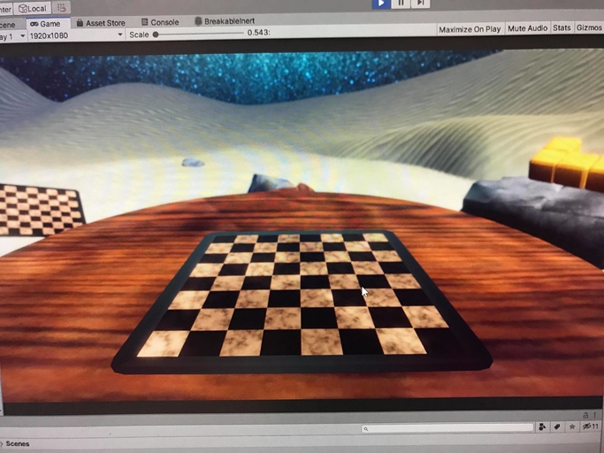
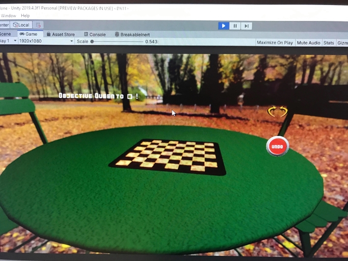
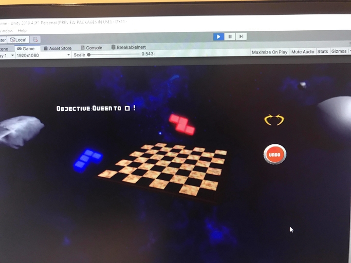
Totally borrowed from my favorite part of Tetris for CD-i, where the tetrion (the Tetris playing field) was integrated into its environments, I added a ton of tetrominos around the board to make the game look like it belonged where you played it.
User Interface
As a major influence of this game became more and more vaporwave-y, I evolved from "soviet looking fonts of old Tetris games" to "roman fonts" to "tall serif fonts". Also, I let the underwater area influence my UI buttons and menus with some wooden boards. Since I don't know 2D asset creation very well, my pipeline was "make a button in blender, screenshot it with a texture on, edit the screenshot in photoshop, and there's your button". A bit tedious, but I liked the results! 
Sounds
I needed to get the music right for this game. I wanted the player to chill out! Major influences on the music were (again!!) the soundtrack to Tetris for CD-i, as well as Luxury Elite, and old weather channel compilations on Youtube. Eventually, I found the amazing Stevia Sphere on bandcamp! I highly recommend her music, please please check it out.
Gamefeel / Juice
The biggest gamefeel change I made involved moving the pieces. Before, in order to move pieces on the board, you needed to click the piece you wanted to move, which spawned clickable squares for movable locations. To me, this sort of eliminated “figuring out” the puzzle, and wasn’t very intuitive to those that use modern chess games (looking at chess.com as an inspiration!). I quickly changed the click + click to a click and drag for each piece. Conversely, this led to the issue where players wouldn’t understand where to drag the pieces to. The final solution was to have the pieces “snap” to their closest available legal move.
Second gamefeel thing: now, when clearing lines, you get some satisfying breaking of the cubes! It was actually through this that helped me realize that designing levels that encouraged players to clear lines was valuable (instead of encouraging players to avoid clearing lines). Which i guess brings me to a larger discovery: before starting this project, as one who primarily prototypes things in jams and short bursts, I never believed in juice. I thought, “if my game design works it should work without juice”. What i found was that while a game can work without juice, adding juice can aid you in finding direction for your design! Maybe I had heard this before, but it was very clarifying to experience it this way.
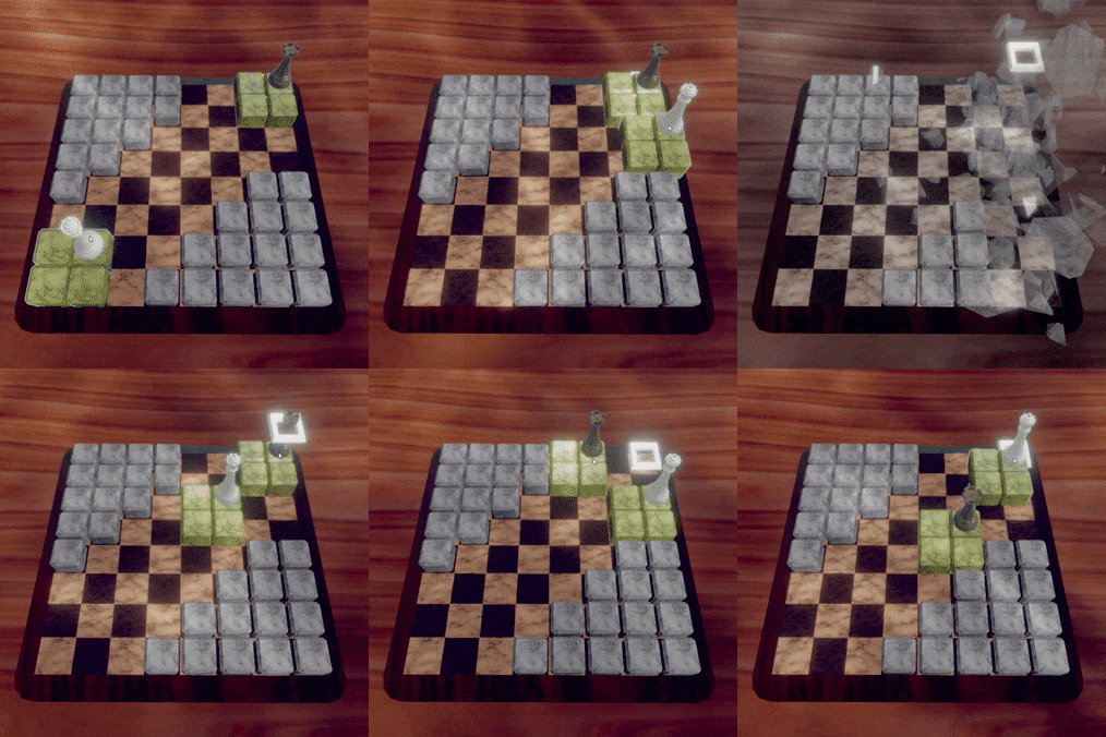
clearing line as a hindrance to the player (Don't move here, or the lines will clear, move stuff around first)
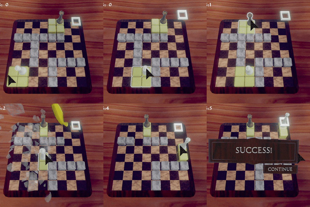
clearing lines as benefit to the player (players naturally looked to clear lines!)
Finally, I had to address a longstanding issue: diagonal movement. I left this until the very end! While I had it for the longest time that in order to move diagonally, one had to have clear space horizontally and vertically, so that during the movement of the piece, no corners would intersect. I ended up reverting this, because the intuition of chess movement overrides the physical collision the pieces have!
To fill in the new environments, i added some postprocessing, vertex snapping, and posterizing for a compressed FMV look. Also some fish!
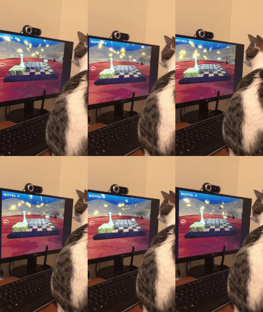
You know the fish are good when your cat watches them.
I added an animated light cookie to the park scene using some tree shadow footage i captured on my phone:

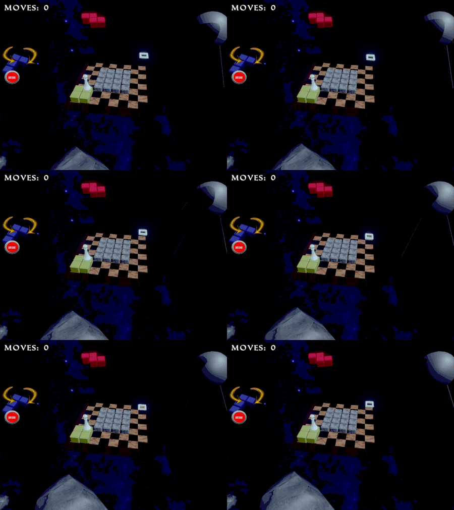
The space level stayed more or less the same, with some added slow rotation of asteroids and tetrominos in the background.
Takeaways
Juice.. good?
While juice doesnt add much mechanically to a game, it really helped me more than I expected in figuring out what made the game satisfying / what to pursue for further development. I feel both late to this idea and as though I am going against some game design mantra here.
Project Upgrades
Don't needlessly update your project to URP or any other version without seriously considering what you need to do for it. After the initial "woo, i can use shadergraph!" feeling, i quickly realized 90% of the things I wanted to do in shadergraph, I could have accomplished in some other way in the other framework I was using.
Moving On From A Prototype
Sometimes, it might not be immediately clear what to change from a prototype. Even after making the change, you might feel what if the thing I was doing before was better? That's primarily why I stopped working on this project: I was unsure if the "make shapes using tetrominos" thing or the "lead a piece to the goal" was more compelling. And I could be totally wrong! I am new at this! Maybe making shapes is cool! maybe one of my super early ideas was the one to pick! Either way, the game won't get made if you don't choose, so you really just have to sit down and try one, even if it's arbitrary which you pick.
so that’s it for now! Thanks for reading, I hope you got something out of it! I’d love to revisit the world of Chesstris in the future, and will definitely update the devlog if so. See ya!
-Jonny
Get Chesstris 2000
Chesstris 2000
A 90s / 00s style block pushing game!
More posts
- Chesstris 2000 V1.0.3 Update (what a mouthful)Aug 14, 2021
- Chesstris 2000 V1.0.2 UpdateAug 10, 2021
- Chesstris 2000 V1.0 Launch!Aug 03, 2021
Leave a comment
Log in with itch.io to leave a comment.