Bleebo's Big Move / Game-a-week #1 Postmortem
Howdy friends! I thought I'd share some thoughts I had during the week-long dev process for my jam entry, 'Bleebo's Big Move', this week!
This week's theme was '10 seconds or less' which was, funny enough, the same theme I had for my first game-a-week program my friend and I practiced ourselves in fall of 2019. That was just when I graduated school and wanted to rapid prototype making games, so I was extremely new to Unity then.
I ended up making Beach Battle, which taught me a lot about time constraints.
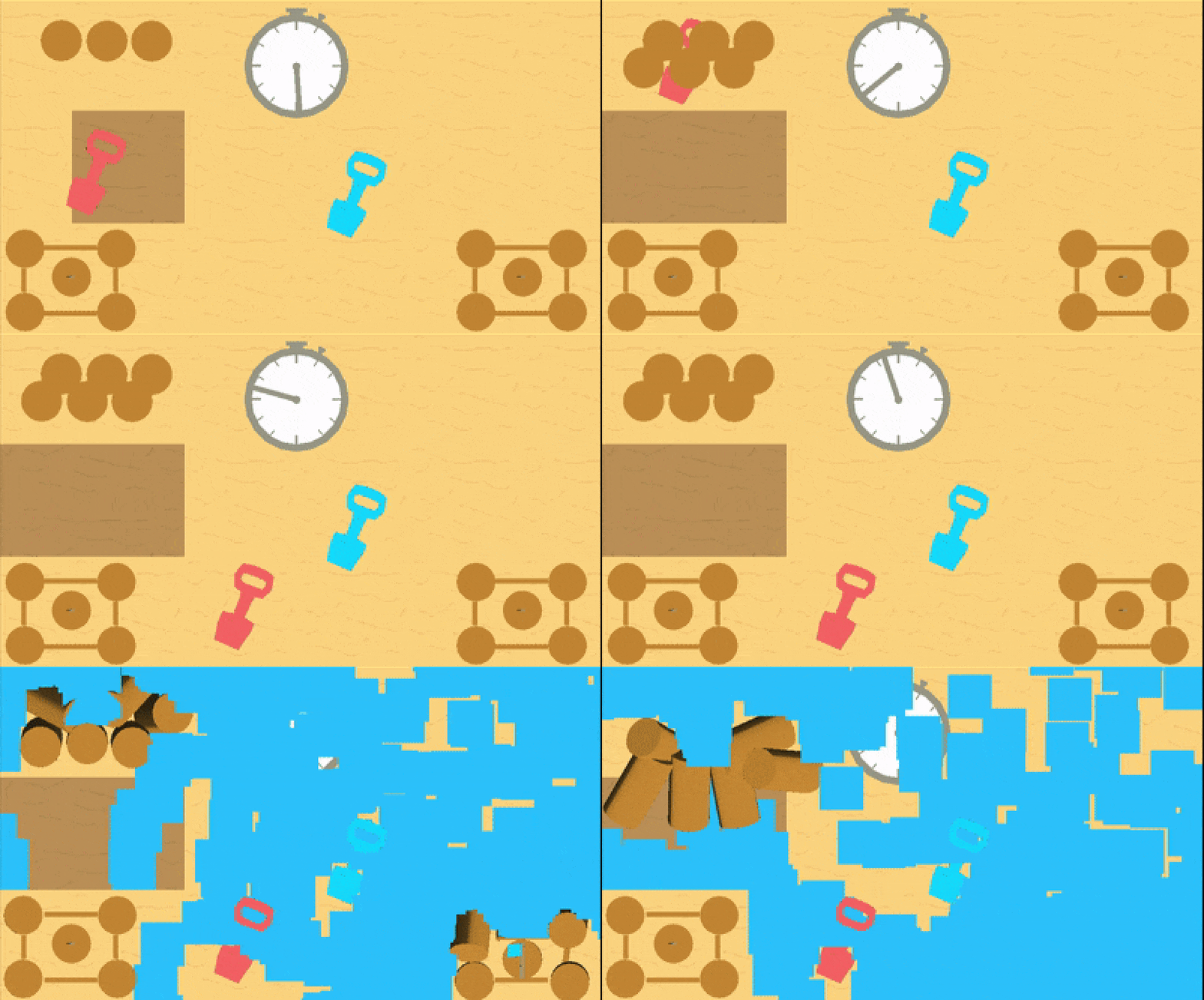
The game involves two people with sandcastles having to defend themselves from an oncoming wave. players have the option of digging and placing sand in front of them or digging up existing sand towers of the opponent to steal for themselves. Funny enough,one of the other submissions dealt with a similar theme, though to much funnier and dramatic extent. (Highly recommend checking it out!!) I think the idea was okay! I'm not sure if it needed to be multiplayer, and it could definitely have some variables tweaked., and definitely does not run super well. I think an issue that arose from this game, and timed jams in general, is that I didn't really have the chance to iterate. What i made was more or less the final version of the project. This time, I (tried?) to learn from that.
Off the bat, I wanted to make something that was already tailored to my interests of weird input. A lot of folks from the jam's discord were posting gifs of super fast platformers, and I wanted to apply the "alt ctrl" design philosophy to that. Honestly, I was looking for a reason for people to smash their keyboards. Having experimented with games for a couple of years now, I also had the benefit of knowing a general area for art direction. I searched through the CARI discord for mood boards, looking mostly at wacky PoMo and Silicon Dreams. I was especially drawn to these lil friends here: 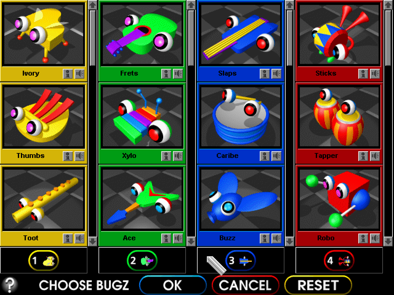
Using day 1 for brainstorming, I made this art direction test on day 2:
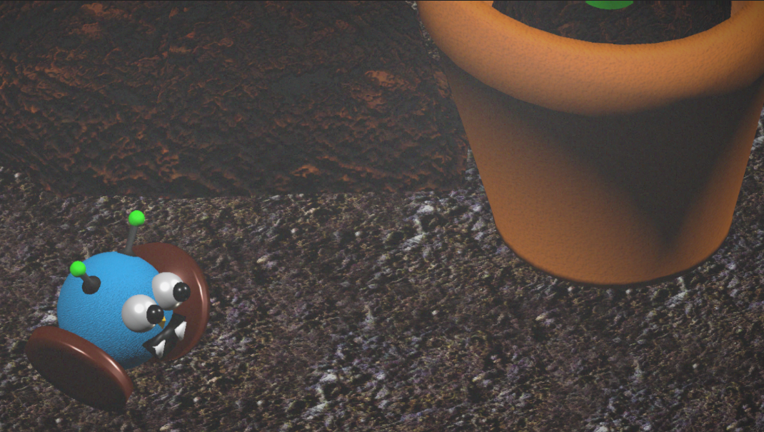
All of the not-super-reflective materials were 'simple lit' unity URP materials, with the reflective ones being 'lit' materials. I tried to focus on texture contrast, with super pronounced normals on the body and nowhere else. I was really happy with it!
To get the noisy look, I made a few transparent noisy textures and put them in front of the camera, cycling them every several frames. A big focus of the development here was using things already built-in and not getting lost in my own implementation of something. I discovered the DOTWEEN library thanks to some friends from the jam, and used pretty straightforward rigidbody physics to get going. Day 3 I implemented this move system, and a way to randomize the controls each time I hit play. Sitting down and having the basic concept playable by the third day was immensely helpful, because it made me realize: having 10 seconds to learn controls is not much time at all!! I originally wanted to incorporate mouse movement as well, which was the only thing that ended up getting scoped out. I needed to find some way to make this easier. Being in a comfortable spot and letting my mind wander on a design iteration, I spent day 4 doing something else entirely: pre-rendered wheels! Two weeks ago I played through Donkey Kong Country for the first time, and was itching to try to replicate its art direction. I had no idea how they were going to turn out, and was extremely pleasantly surprised :-)
i made this wheel using a reference from WikiCommons: 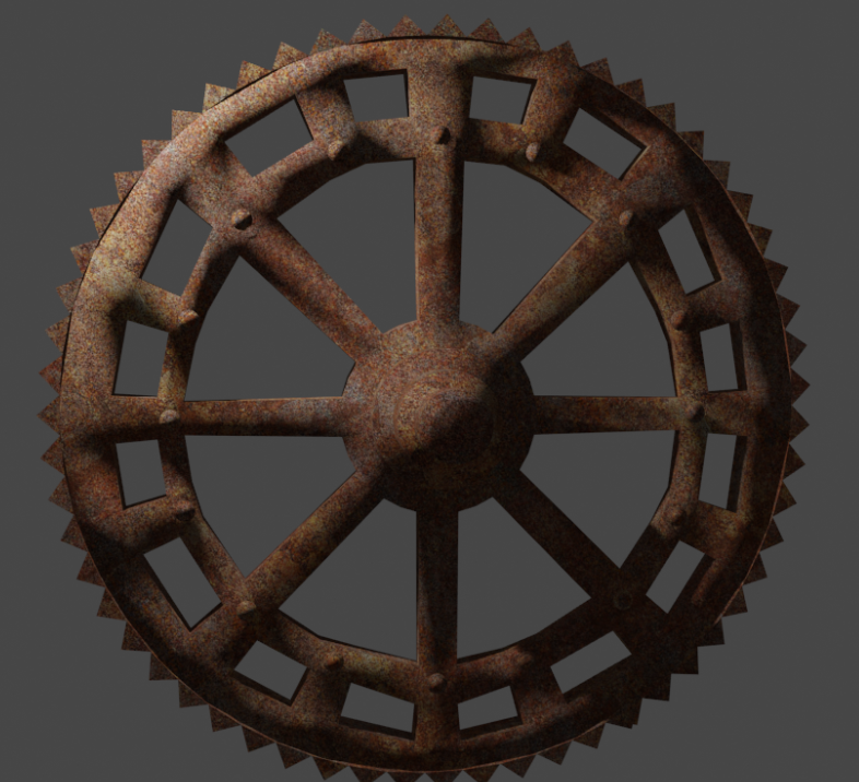
And then made a texture like this: 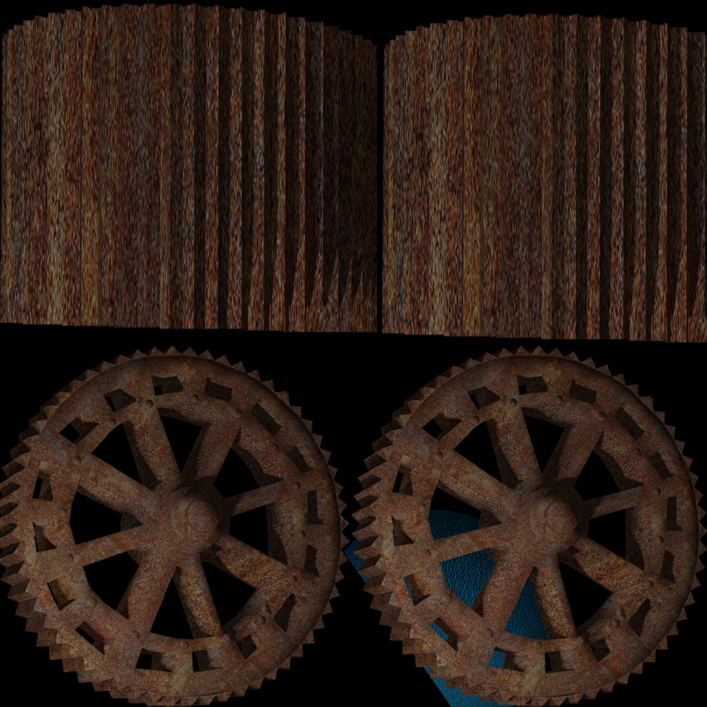
I faked some transparency by adding in some of the body into the wheel texture. I rotated the wheel 30, then 60, and remade the textures. a three frame animation ended up looking pretty smooth.
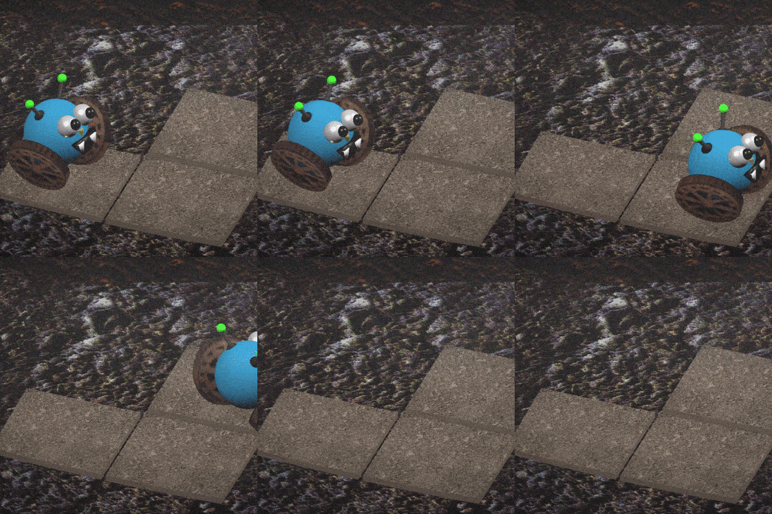
something i definitely struggled with was camera distance: i wanted the player to see the effort I put into the wheels and the texture on the body, but also be able to move through the stage. I spent day 4 doing some alternative forms of movement to be randomized in, too: tank controls, button mashing, and a 'golf' movement. More on that later. Another major issue, one that I run into too much, is that keyboard smashing games often have to deal with key-rollover. Most USB keyboards can only process four or so buttons at once, and if you're smashing your keyboard, you may think it is unfair that a key you thought you pressed wasn't registered. I ended up making this visual guide on day 5 to help the player out by downloading a keyboard stock image, (painfully) separating the keys into layers, and turning them grey or green when pressed.
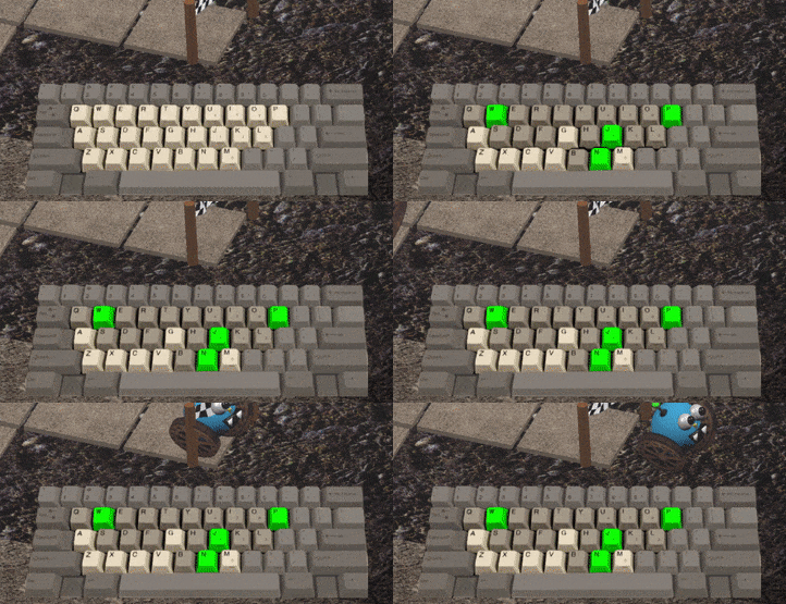
Before I started making it I was worried that it would remove the 'fun' of finding out which keys were a part of the controls, but after playing with it a few times, it was extremely helpful. Day 6 I spent making the controls diegetic, where I again rain into the issue of smushing the game onto a smaller screen. I wanted to have some close-ups for the starting/ending screens to help resolve it. I also set out to make more than 1 level on day 6, and was planning on implementing some sort of track generation. After not being able to brainstorm a good track generator quickly (each track also has invisible walls around it, I couldn't figure out how to auto generate them that wouldn't take me awhile to implement) I just made 14 or so levels by hand, which was boring, but probably faster in the end. Ended up with this!
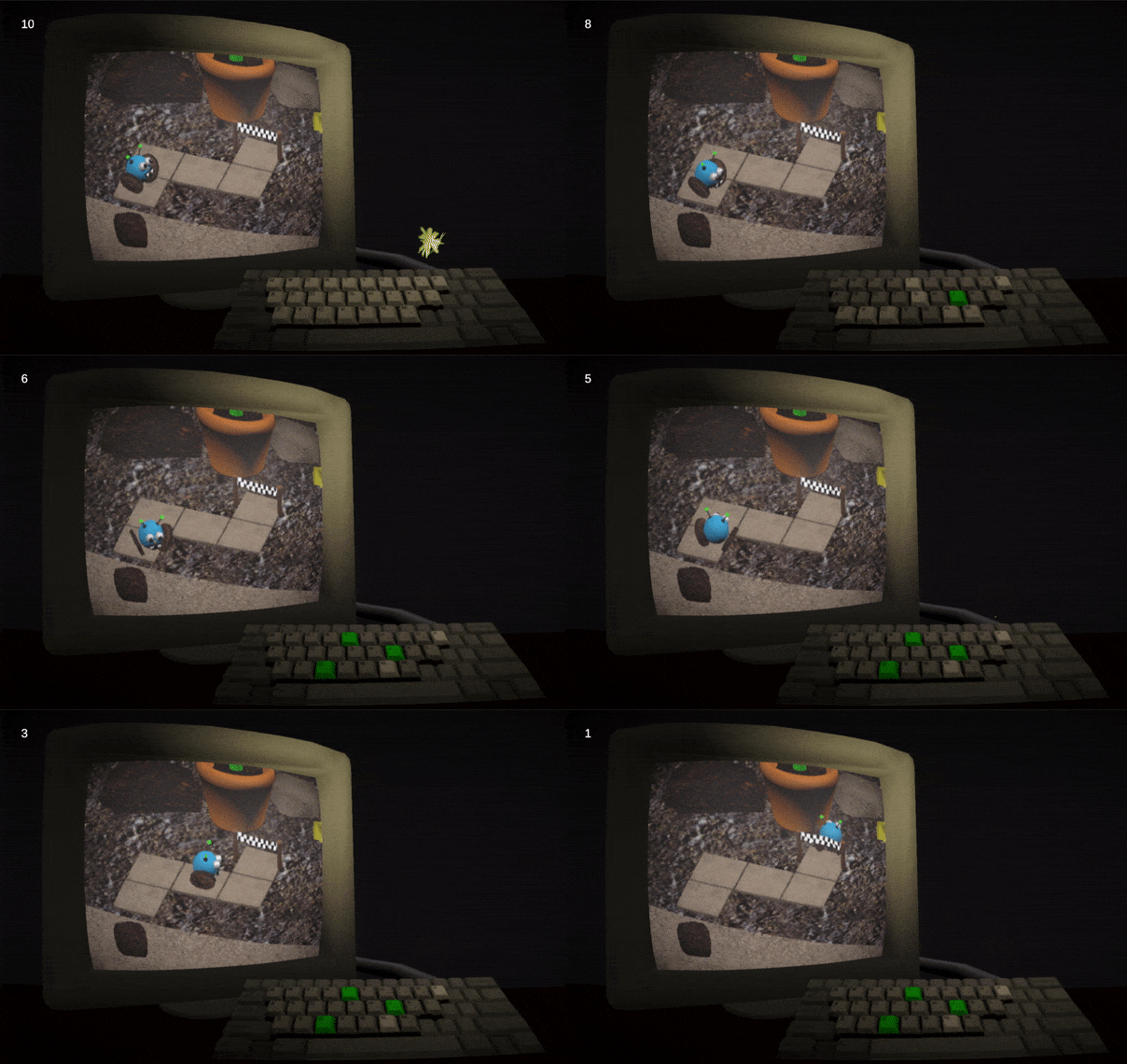
day 7 was doing the annoying last 20% of the game: menus, ending state, etc. early this morning, after seeing people play the game, I started to realize that people weren't always picking up the different movement systems. I made the randomized key controls make sense within the universe of the game, but there wasn't really anything to understand a different type of movement each time. Plus, getting a different movement than you had last time with only ten seconds to win might come across as (too) frustrating. Post-submission, I made one more build with some explanation!
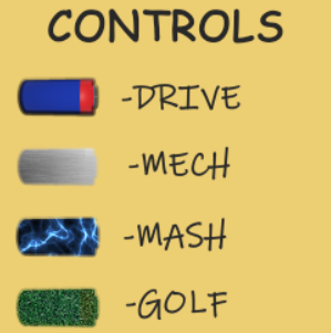
I made a different meter for each control system. Hopefully that saves a second, which you need in a ten second game. That's about it! I worked a bit more than I wanted to this week, I will hopefully spend a bit less time on games in the coming weeks. Though I am happy with spacing out the dev process and making the core concept iterable as fast as possible! I will try to post devlogs for each week too. Thanks for reading! -Jonny
Bleebo's Big Move
a 10 second alt-ctrl maze
| Status | Released |
| Author | jwhop |
| Genre | Action |
| Tags | 3D, bleebo, crunchy, Cute, Difficult, Fast-Paced, frustrating, Funny, gameaweek2022, stan-bleebo |
Leave a comment
Log in with itch.io to leave a comment.